Thomas Chavez
Detroit Pistons Writer
The Detroit Pistons have finally done it. They have officially gotten rid of their terrible chrome colored alternate jerseys.
On Wednesday, the Pistons unveiled their new “Statement Edition” uniforms, which they will wear in the upcoming 2022-23 season.
The new jerseys feature the letters “DET” along the chest in a hollowed white font. A pair of red and blue stripes run across the jersey just below the lettering and along the sides of the shorts.
The announcement of the “Statement Edition” jerseys comes just over a month after the team announced the return of the teal jerseys with their “Classic Edition” back in July.
Both uniform sets will be paired with a unique court design.
With the release of the “Statement Editions”, Detroit is now entering the 2022-23 season with four uniform sets. The “Classic Edition” teal and “Statement Edition” blacks join the traditional “Association Edition” whites and “Icon Edition” blues. The red “City Edition” jerseys from this past season will not be returning for the upcoming season, as they were 75th Anniversary one-offs. The Pistons can still add a “City Edition” to their jersey rotation next season.
(Note: the Pistons are unveiling additional uniforms designed by Big Sean in October)
Of the four jerseys the Pistons have going into next season so far, which are the best? In this article, I grade all four of Detroit’s jerseys and rank them.
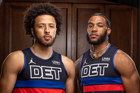
4.) “Statement Edition” Blacks
Grade: C+
Pistons NEW statement edition uniforms, replacing the grey uniforms (2017-2022) via @JLEdwardsIII
🔥 or 🗑? pic.twitter.com/uBHlSKI32T— Woodward Sports Network (@woodwardsports) September 7, 2022
Detroit’s new “Statement Editions” are fine. The jerseys are not ugly by any means, but they also do not really do anything special that makes them more than average.
The black is a good look. It seems like every sports team is trying to produce a black alternate jersey, and they do it for good reason. Black is an easy color to work with, and it almost always looks good on a court or a field.
The biggest thing holding this jersey back is how plain it is. Something else every sports team appears to be doing nowadays is streamlining their uniform designs. We have seen the simple, yet ugly, designs the Utah Jazz announced earlier this offseason. The Cleveland Cavaliers did something similar with their redesigned jerseys.
Detroit’s “Statement” uniforms are more in line with the Cavs’ than the Jazz’s. They are not ugly, but they are not anything that special either.
Overall, the biggest thing going for these jerseys is that they are not the chromes.
Pro: Black always looks good.
Con: Very simple design holds it back from standing out
3.) “Icon Edition” Blues
Grade: B-
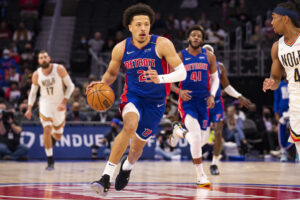
Feb 1, 2022; Detroit, Michigan, USA; Detroit Pistons guard Cade Cunningham (2) drives to the basket against New Orleans Pelicans guard Devonte’ Graham (4) during the first quarter at Little Caesars Arena. Mandatory Credit: Raj Mehta-USA TODAY Sports
Let us be honest about the Pistons’ blue uniforms for a second. These things are a very loud combination of blue and red. Does it look good? Meh.
There is nothing wrong with the Pistons’ blue uniforms. They are a classic design that the team has come back to for years.
That being said, these are definitely the least wearable of the Pistons jerseys. As simple as the “Statement Editions” are, the black jerseys will look good on fans wearing them to the arena. They are something fans could easily wear out and about as well. The blues on the other hand, not so much.
They are not ugly. They look good, even. Just, only on the players. On fans, not so much. Wearing them to the stadium is passable. Wearing them out in public, they stand out like a sore thumb, and they are simply not cool enough for that.
Still, the “Icon Editions” are a reliable design for Detroit. The history of the design alone is able to bump it ahead of the “Statement Editions”, but it is not like they are that much better.
Pro: Classic design that looks good on the court
Con: Very bright colors are standoffish when worn outside the arena.
2.) “Association Edition” Whites
Grade: B+
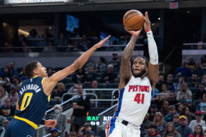
Apr 3, 2022; Indianapolis, Indiana, USA; Detroit Pistons forward Saddiq Bey (41) shoots the ball while Indiana Pacers guard Tyrese Haliburton (0) defends in the first half at Gainbridge Fieldhouse. Mandatory Credit: Trevor Ruszkowski-USA TODAY Sports
From a design standpoint, the Detroit Pistons’ white uniforms are very similar to their blue uniforms. Swap out the blue base for white and switch one of the red stripes running down the side to blue.
So what separates these jerseys so much? The white jerseys actually look good off the court.
Like black uniforms, white jerseys are very easy to make look good. Detroit’s whites are no different. The “Association Editions” are a classic design. At this point, both the whites and the blues are unlikely to be changed out at any point in the not-too-distant future.
There really is not much more to say about these jerseys. They are the blues except white, but better.
Pro: Classic Design looks good on and off court.
Con: The Pistons’ uniforms are kind of basic.
1.) “Classic Edition” Teals
Grade: A-
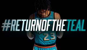
Not everyone at Woodward Sports is a fan of the teal jerseys. They are from an era where the Pistons did not have a lot of success. But, they are from a nostalgic era where NBA jerseys were at their most creative designs.
Like the blue “Icon Editions”, the teal is loud. However, what separates them from the lesser blues is that they go all out with it. The teal coloration combined with the giant horse logo on the front are simply beautiful.
Last year’s “City Edition” red jerseys would hold the top spot if they were returning this year. They were one of the coolest designs the Pistons have ever had on a jersey. However, they are not returning, so the teal holds the top spot.
Are the Pistons’ teal jerseys a perfect design? No. Are they the standout design from Detroit’s lineup this season? Yes. Say what you want about Detroit’s teal jerseys, but there was a lot of hype surrounding their return. They are sure to be the highest sellers of the four designs Detroit has this season.
Pro: The most fun and memorable design out of all four of Detroit’s options this season.
Con: If you did not like them in the 90s, you are not going to like them now.